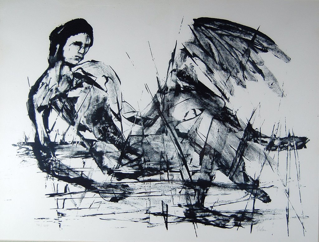
26 February, 2007

Back from San Francisco!

Hi! This is Frances, for a change.
You might get the idea from all the swans and sheep that life is rural and gentle at The Old Stile Press. However, this last month has been hectic and full of contrasts for me. First, the Works on Paper Fair at the Royal Academy where we met an amazing number of people, most of whom were unfamiliar with the book as art, or even a repository for art. For a long time we have endeavoured to find opportunities for our books to be seen together with works of art not just among books and this proved to be all that we had hoped. Many of the visitors to the fair were hugely excited by the books they encountered (not just ours) and bought enthusiastically. The logistics of getting ourselves and books to central London at short notice and then staying for five days took some considerable effort and then back to base to spend a day wrapping and despatching a large number of parcels before setting off to California. So I set off on a high, though exhausted.

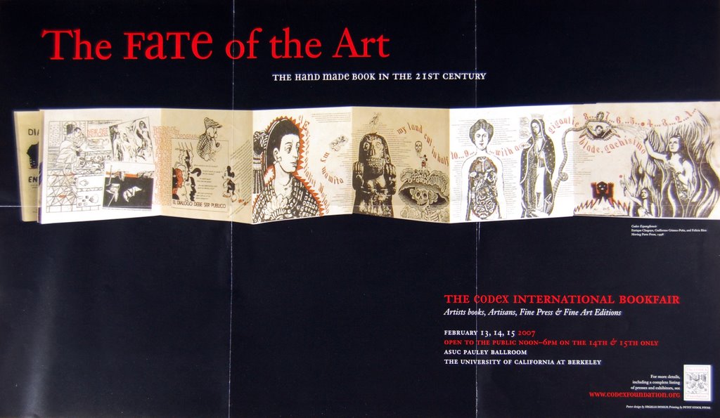
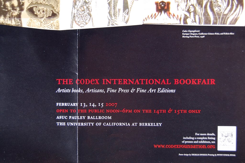
I should have known - but it was nevertheless unexpected - I left Britain in snow ( and Nicolas has some horror stories involving being snowed in at home alone, fallen trees and chainsaws) and arrived in California in rain. When it rains there, it really rains although it had waited for two dry months to tip it all down on my head! My destination was Berkeley (the University Campus was alive with anti-war protests, drumming and singing in the main plaza) where printers, book makers, librarians, collectors were coming together for a symposium and book fair for four days prior to the world famous San Francisco Antiquarian Book Fair. The contrast was great and discussions changed gear because all these folk were deep into books, their history, the way they are produced, presses and the intricacies of their productions. The way they all looked at books was so different from the buzz generated at the Academy. That is not to say there was no buzz here too but of a very different nature. Many of the books produced by Californian artists explore structures and are many layered in terms of imagery and printing method - often startling and eye-catching and make our books seem very cool and spacious. At first I thought this was going to mean that no-one would choose to buy from us - however, on the third day that changed and we sold to some very enthusiastic people. During the course of the event, however, I had the pleasure of meeting librarians and collectors who had previously only been august names.

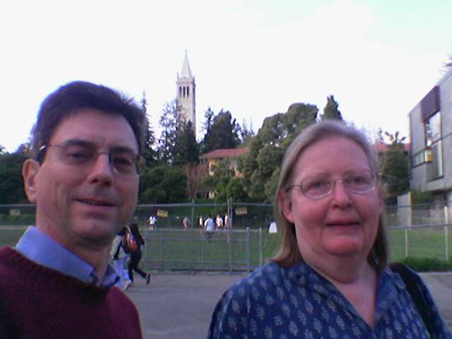
Martyn Ould's mobile phone captured this shot of us with the Berkeley Campanile behind us - he was showing his Old School Press books and there were six other British presses who made it over to California. In all, there were about a hundred presses showing their books, with a sprinkling of papermakers and leather suppliers for bookbinding. It was a remarkable gathering and evidence of a healthy interest in the creation of books - but one of the questions posed was whether an art is dead if it is only appreciated and bought by its creators. The works shown would certainly demonstrate vitality in the huge variety of approach to the creation of books. Coincidentally, the vitality is best demonstrated by the much greater interest shown in books at the Royal Academy show where the buyers were certainly not makers. They did, indeed, find it of added interest to meet the makers rather than the more accustomed (in that context) gallery owners.
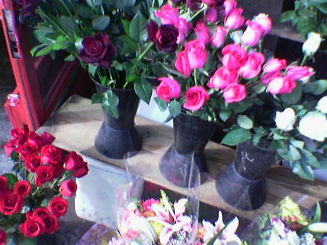

Valentine's Day found Berkeley awash in flowers - everyone seemed to be giving and receiving bunches of roses, or a single flower . . . no more the faltering anonymous card sent to the seemingly unattainable person of one's dreams. Far distant from our partners, Martyn and I had the brilliant thought of taking a photo which could be sent by e-mail to each partner. N had the effrontery to wonder if the roses were on a garage forecourt - hey, they were the most flamboyant in town! Having said that, the flower shops themselves were not what astounded me, but the green of Berkeley and the profusion of growth. Yes, there were daffodils, primula and tulips but also arum lilies, agapanthus, roses, caeanothus all of which grow almost wild on the hillsides and huge Magnolia grandiflora, eucalyptus and pines - how do they know what season it is there! I managed a trip around the bay to see the skyline of San Francisco and its bridges. The photograph might seem stagy but it really was that glowing orangey-red with dark outlines of bridges and islands and distant mountains. Overwhelming, especially on top of such an outpouring of books and conversations with the people who made them . . . at breakfast and every moment throughout the day!


12 February, 2007

How I wish this book was one of ours! . . . 3


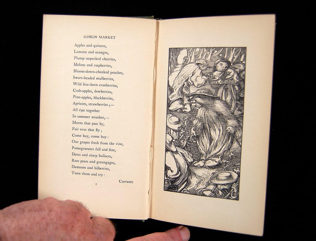
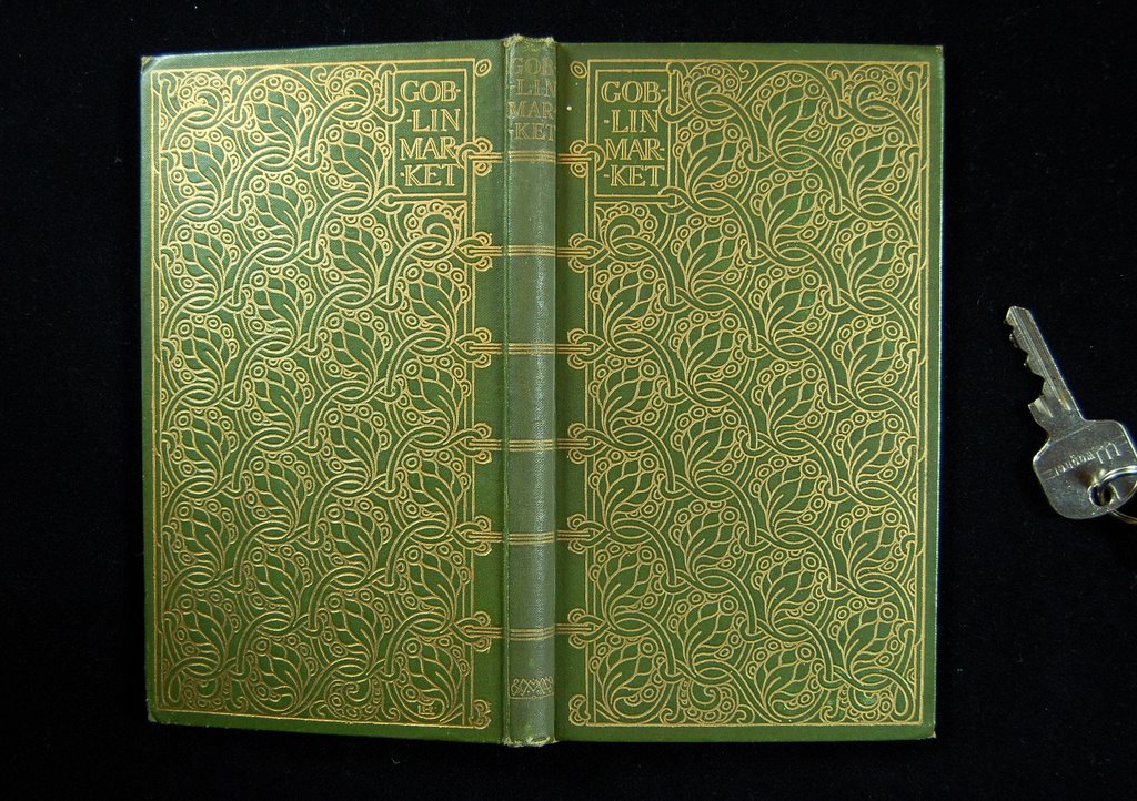
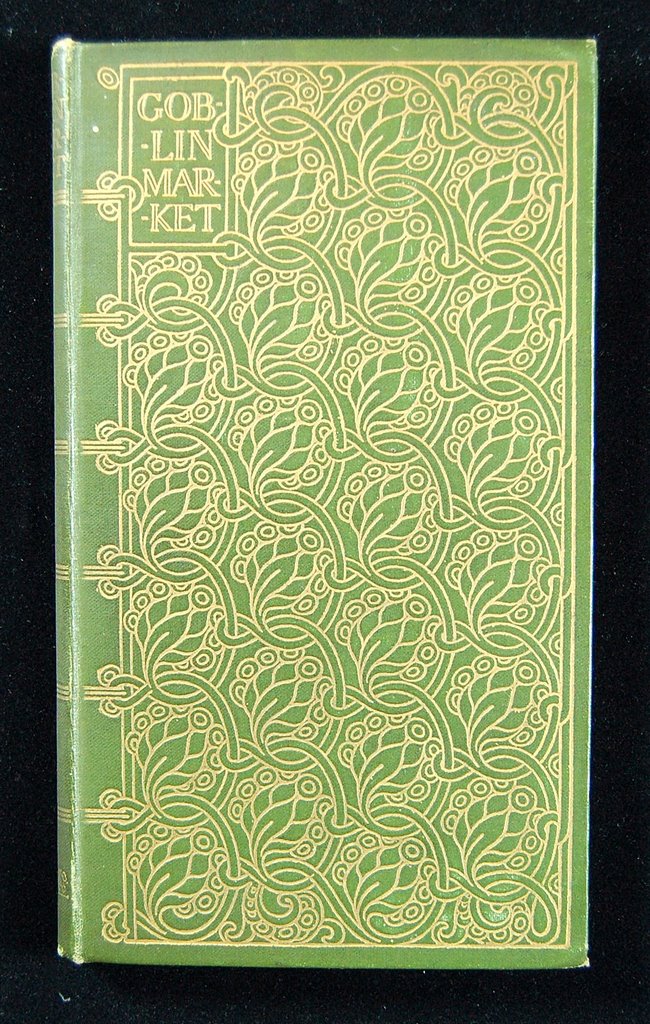
This is one of the most entrancing books I have ever held in my hands. I put it like that because it is really is delicious to hold. It is smallish, as my comparison shows, but is by no means a miniature. It also delights in the tall format that has been a great favourite of mine for as long as I can remember.


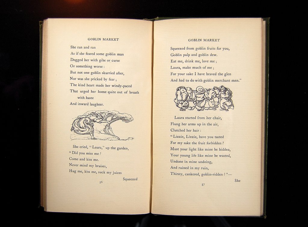
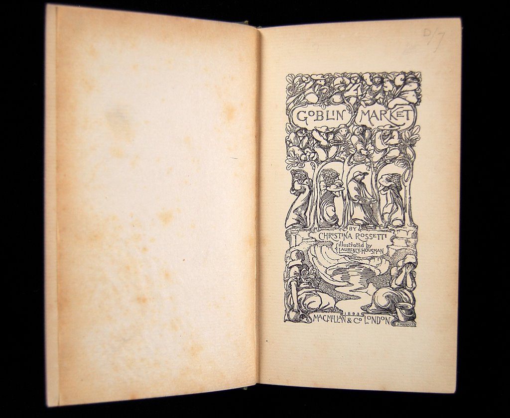
It is an edition, published by Macmillan in 1896, of Christina Rossetti's weird and haunting poem, Goblin Market. The wood engravings were designed by Laurence Housman but were actually engraved on to the wood, and with the greatest skill, by his sister Clemence Housman.


A quick glance shows that the artist was not just doing a number of pictures to be handed over and popped into the publishers' book by a workaday printer. Rather, it is clear that Housman was entirely responsible for every single detail of the book's design and physical make-up (even though it was never anything other than a 'trade edition') and contemplation of this fact and the wonderful result of such 'oneness' of purpose has been a tremendous inspiration for my attempts to 'go and do likewise' at the OSP.

The richly gold-blocked cover, front AND back, makes the book, as it nestles in the hand, seem like some rare decorated treasure . . . but the repeated pattern is actually straightforward and 'wholesome' rather than over-wrought and leads seamlessly into style of the imagery within.


The titlepage is deliciously detailed but it is the next opening - the first page of the text - which takes my breath away and seems to sum up all that I am trying to bring to our books.


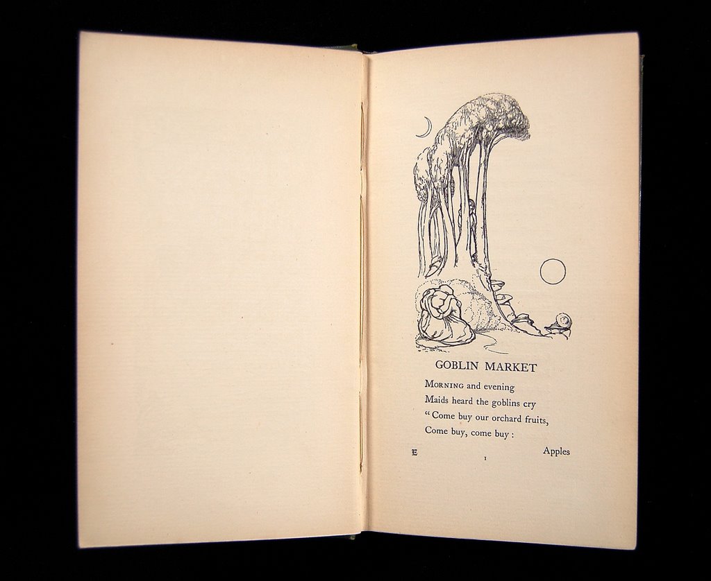
How daring . . . just the title and four lines on this page but with an image which seems to sum up completely the atmosphere in which the story is to be told in the same way that a painted gauze can prepare the audience for what an opera or ballet is about to describe. The image is not particularly large of course but it has been completely released from any box-shape or framing square. Its energies rush out and inhabit all of the space offered by that whole spread. Sun and sickle moon we see . . . and think of Samuel Palmer, the other Ancients and all the tradition down to the Neo-Romantics whose work I love so much. Almost a cliche already, but I don't care!


Through the book there are a number of single page engravings (which face a page of text) and a number of small vignettes which punctuate the text, as you can see above. Most amazing of all, though, are the pairs of mighty engravings which are separated from each other by the book's gutter but which actually form a single image.


What a glorious treasure!

07 February, 2007

Off she goes again!


As I write this, Frances is preparing to fly off to San Francisco. Indeed I am typing this so as not to get in her way for it is past the point where I can help. It is just a touch unkind of Fate that, on the one day we have to leave the house in the middle of the night, a blizzard is expected. If you never hear from me again I shall, ironically, have perished in the snow in the attempt to get Frances to California!

She is going to show our books at the event described above . . . and to meet a lot of nice people and, I hope, to have an enjoyable time. Everyone says I should go too but I really do prefer to stay at home for some reason and someone's got to do the printing! She also reckons that I can be a liability if I try to 'present' our books at a fair for, if someone looks at a page for more than a few seconds (which they should, of course, do), I presume they must have seen an invisible imperfection in the printing . . . and I have to start apologising for it!

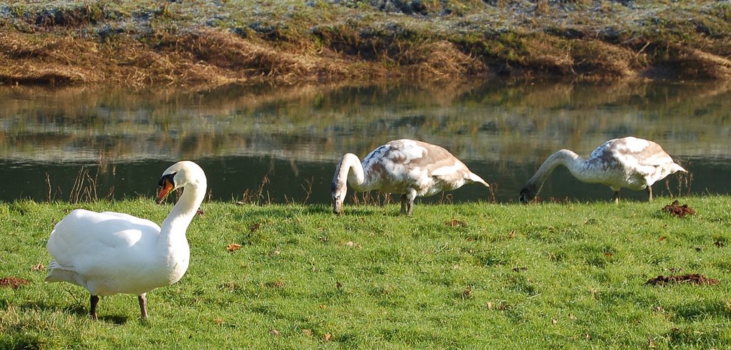
So I will continue to print Glenys's lovely images on the Black Marigolds pages and talk to my friends, the grazing swans!

03 February, 2007

Jolly funny sheep!

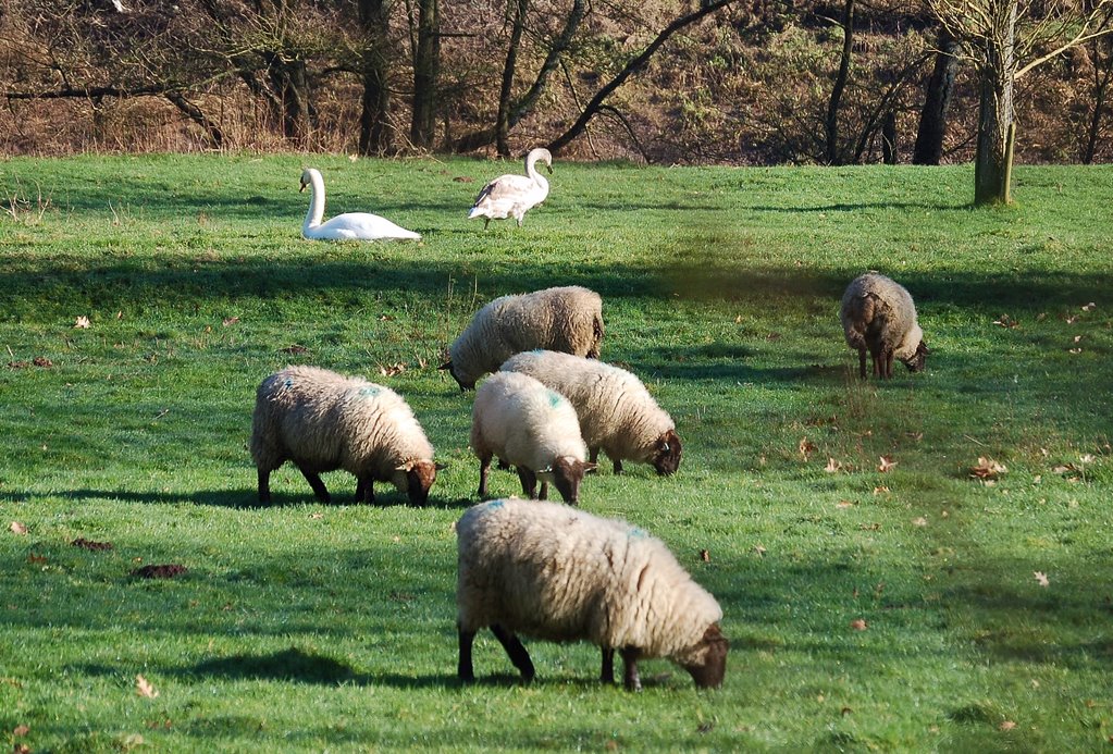
Such a lovely morning here . . . I thought it would be fun to take a photograph (to be entitled "Sheep and swans may safely graze") to point out the contrast between what I am doing and what dear, wonderful Frances is doing on her trip to London and the Royal Academy (see below). In fact, I know she is having a great (though exhausting) time and meeting lots of interesting people.


Having bagged that one I suddenly became aware of developments which lead to this . . .


. . . and then this!

I had expected a bit of a quarrel but there was none. The sheep's 'interest' is clearly real but I could not begin to divine its nature. The swan's ridiculously coy pose must, I feel, be down simply to the moment of shutter capture!

25 January, 2007

Artists' Books at prestigious Art Fair in London.

Covered!
is the title given to an exciting new addition to the Watercolour and Drawings Fair at the Royal Academy of Arts, 6 Burlington Gardens on 1 - 4 February. It is part of the Modern Works on Paper section which fills the ground floor with prints, photographs and posters.

However, one room will be filled with BOOKS which are true marriages of text and image - some created entirely by a single artist and some which are close collaborations between an artist and a designer/printer. This will be a rare opportunity to see and handle the work of about a dozen presses, each sought after by libraries and collectors worldwide.

Such books preserve the craft of printing directly from an artist's work. They use fine materials and are accorded the time and care which is often lost in large scale printing processes. Such books, filled with original prints, will present entirely new experiences for many collectors and readers to discover.

The presses are: Susan Allix, Altazimuth, Enitharmon, Gwasg Gregynog, Inky Parrot, Old School, Old Stile, Parvenu, p's & q's, Tern and Whittington.
Nearly all of these have a website to explore with details of their books and the press.

More details of the Fair itself, including dates and times, are at
www.watercoloursfair.com

22 January, 2007

What's on the press at the moment?

Black Marigolds by Powys Mathers is an amazingly sensuous poem of love remembered and yearned for. The original was written by Chauras, a young Brahman poet, about nineteen hundred years ago but it was in 1915 (while in wartime 'hutments' on Salisbury Plain) that Mathers 'englished' the fifty stanzas in such a haunting way. To be a young poet imprisoned for having loved the king's daughter and to know that the morning would bring the loss of one's head - for this is indeed the scenario - might well concentrate the mind and this is suitably powerful stuff.

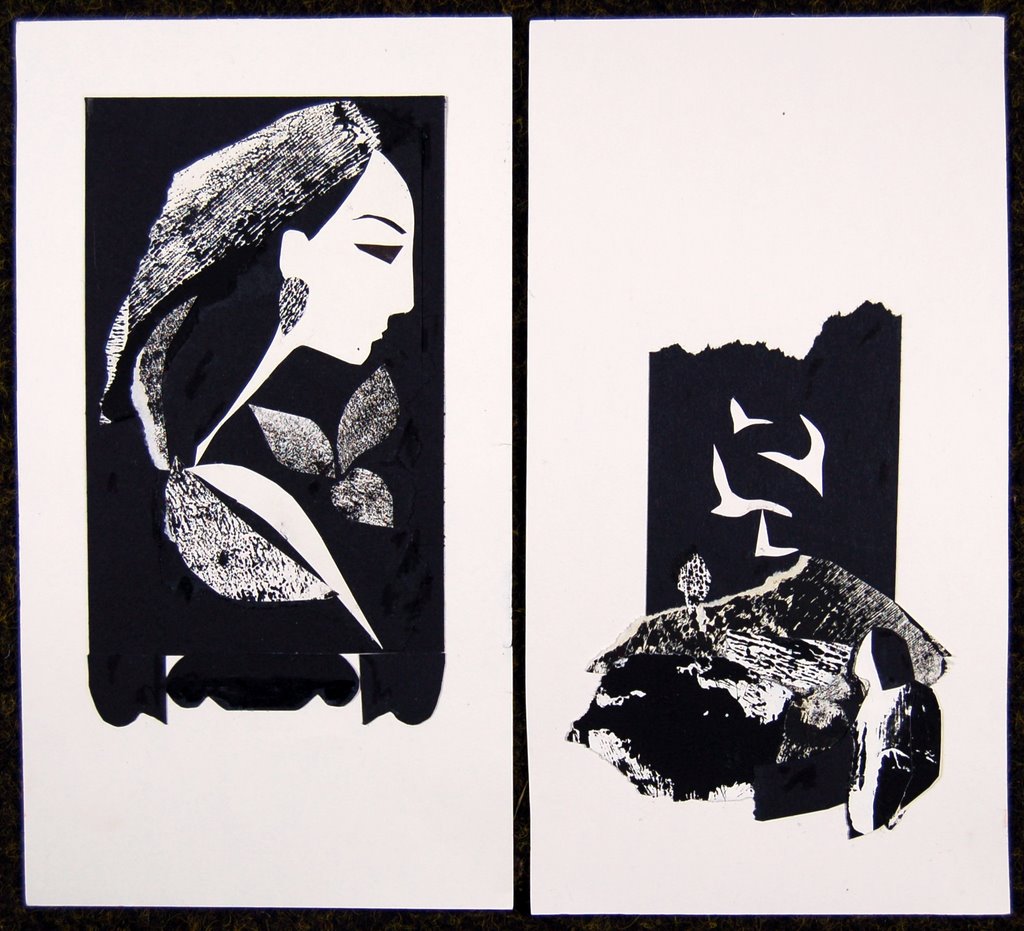
I am in the middle of printing the text (in a beautiful burnt orange ink) but I long to get to the images . . . by the wonderful Glenys Cour.

Above are photographs of two of the collage artworks - from which I make blocks to print. This book has a smallish, tall and very concentrated format which seems to us very right for the subject (and we also have some exotic ideas for the binding but I'm keeping mum at the moment!) but is completely different from the earlier book we published with images by Glenys Cour.

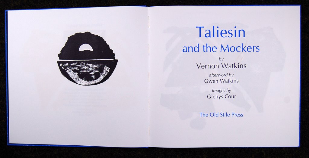
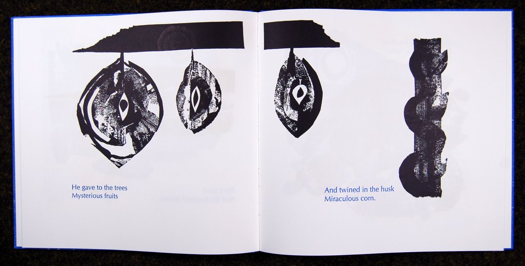
This was Taliesin and the Mockers by Vernon Watkins, with an afterword by Gwen Watkins and a commendation by Rowan Williams, Archbishop of Canterbury.

In case you have not seen it, here is its front cover . . .


and here its titlepage spread . . .


and one of my favourite two page spreads.


Full details can of course be found here.

15 January, 2007

Charles Shearer

We went to our friend Charles Shearer's most recent exhibition (at the Galanthus Gallery in Wormbridge, Hereford, UK) armed with my trusty camera but unfortunately without checking its battery. It succeeded in taking the striking, if surprising, image above - among a number of others which were more or less random in such matters as focus and exposure - before giving up the ghost entirely.

This exhibition continues until 20 Feb and consists of a number of Irish (and some Cornish) landscapes in his unique style. To quote the catalogue: 'Charles' work sensitively depicts the processes of wear and decay in a way that seems to raise an unloved and often forgotten ruin to the status of well-loved, stately old gentleman.'

The two works on paper given below are NOT part of the exhibition and were photographed when my camera was properly charged!

I cannot resist whispering to the world that we have been trying to persuade Charles to join us to produce a book for about FIFTEEN YEARS!

All parties concerned are keen but all sorts of things seem to intervene to make it not happen. I am not quite sure why but I feel that the renewal of good intentions this time might just bear fruit. Watch this space!

03 January, 2007

. . . for Books that Never Were


We have been very pleased to read an article about our activities in the January 2007 issue of The World of Interiors, by Bridget Bodoano, which incorporates a kind review of this book.


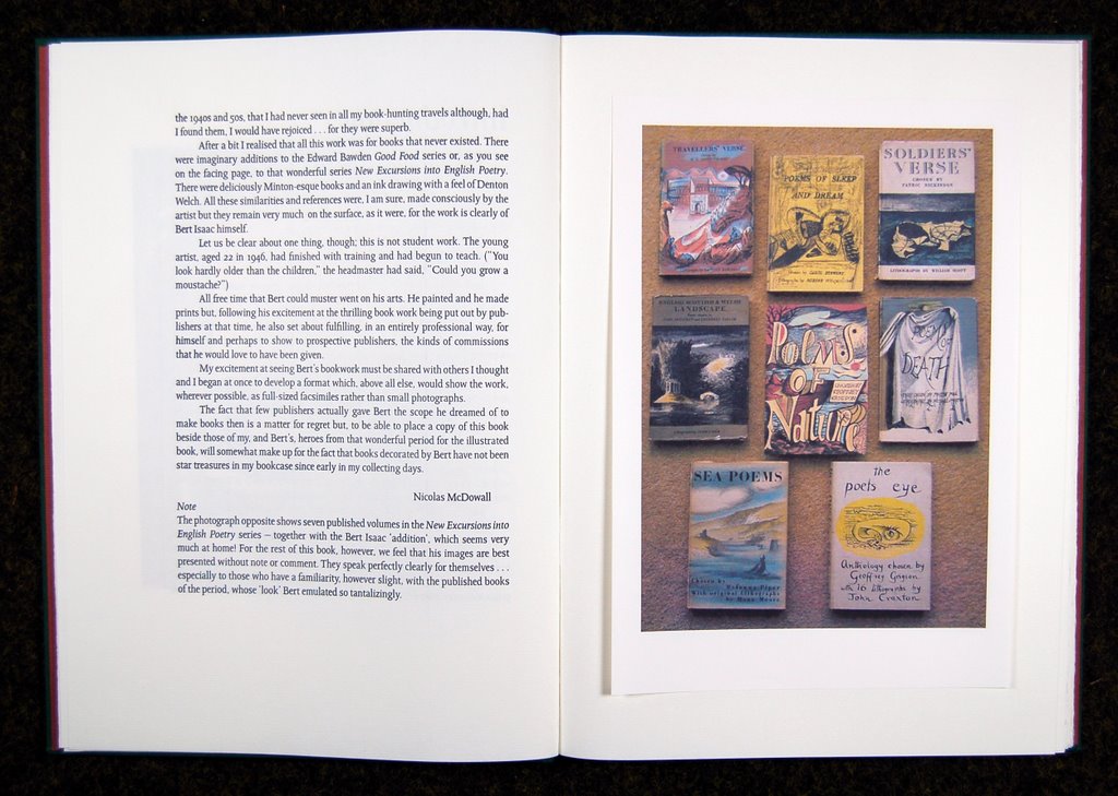
Among Nicolas and Frances’s artist friends was Bert Isaac, who, as a contemporary of Ceri Richards at Cardiff College of Art in the early 1940’s, was influenced by Neo-Romantics such as Graham Sutherland, Henry Moore and Paul Nash. Like them, Isaac used landscape as the basis of his work. He was a founder member of the Welsh Group in 1947 and for most of his life was also an inspirational teacher. In 1992 The Old Stile Press published his woodcuts and meditations on the creative process: The Landscape Within.
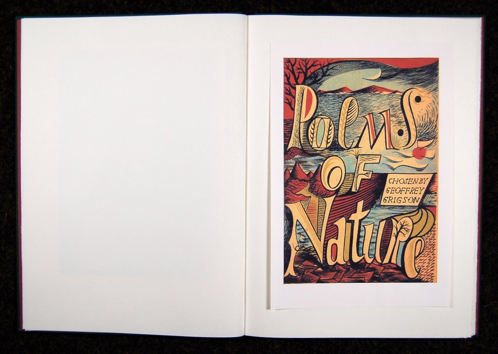
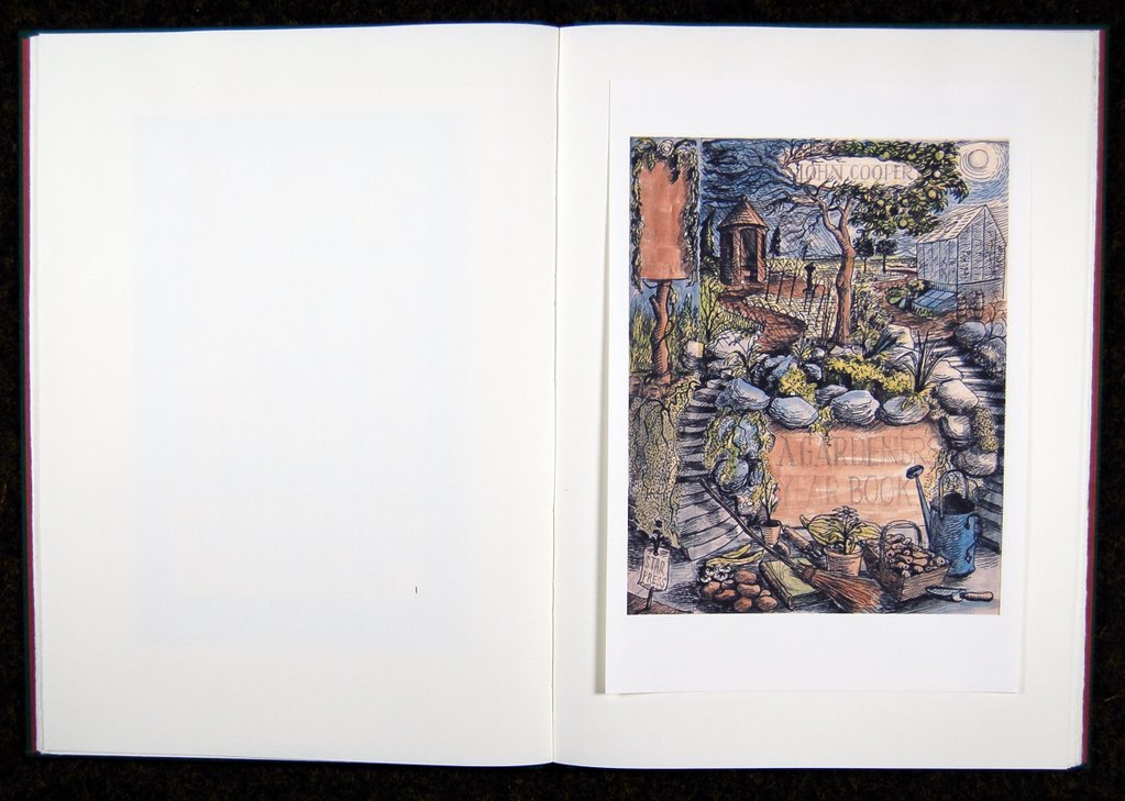
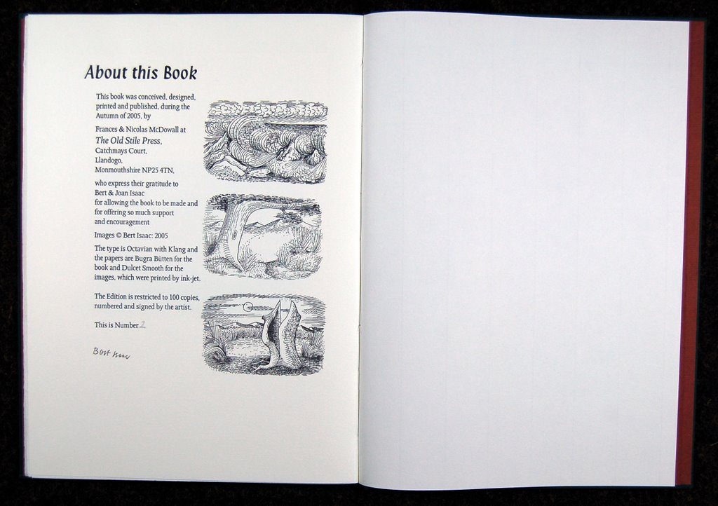
Their final collaboration . . . for Books that Never Were features a recently rediscovered collection of book designs made in the 1940s and 1950s for his own pleasure. These were not actual commissions but imaginary publications, including New Paintings by Paul Nash and additions to both Edward Bawden’s Good Food series and New Excursions into English Poetry. It is difficult to believe that these books never existed as they somehow look familiar. In drawing (literally) on the styles of the artists and of the times Bert Isaac has created phantom editions that admirers of the books of this era would surely love to add to their collections. Bert Isaac died, aged 83, shortly after the book was finished.

For full details about this book, please click here.


14 December, 2006

Welcome!

This post is directed particularly at anyone who may have received a Christmas Card from us with a little note attached and felt constrained to drop everything to find us here! You are very welcome and here to greet you is a little poetic license! With the weather outside so dank and dark, why not imagine for this Journal a little early Summer instead. The power of the blog!

If you move downwards in this column of text and image, you will move backwards in time, post by post, until you reach November 1st when we started out. If you want to return to our website or to visit it for the first time, in order to see what The Old Stile Press is up to, just click here.

Do come again!

11 December, 2006

How I wish this book was one of ours! . . . 2


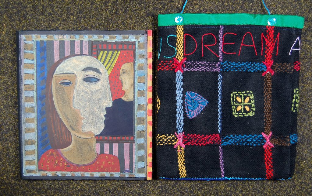
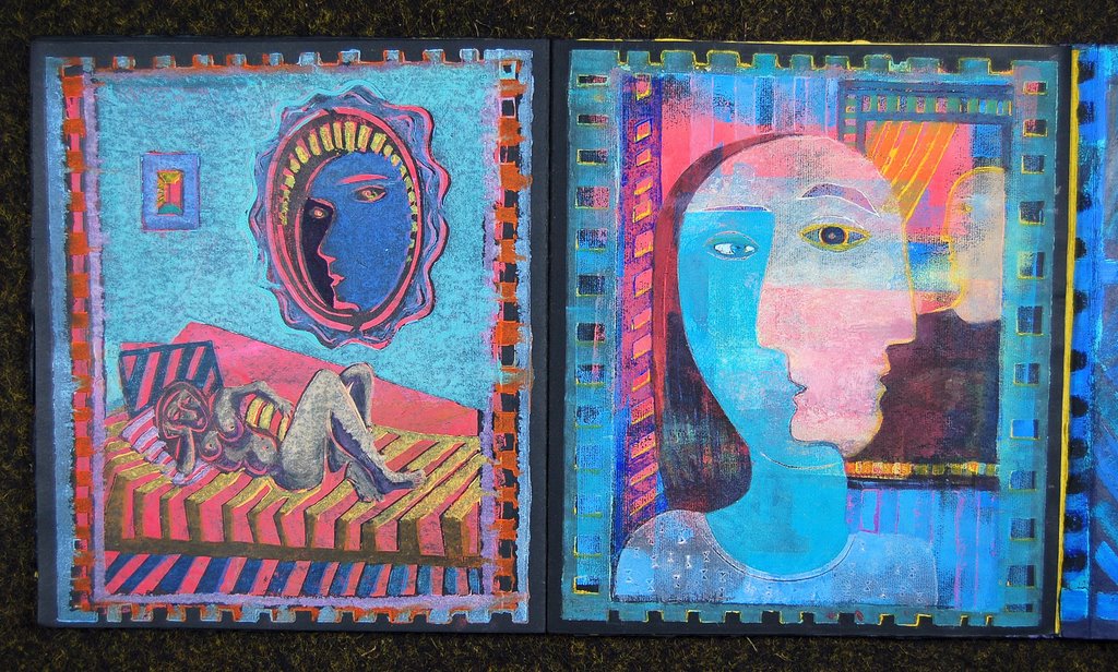
Natalie d'Arbeloff is a one-off if ever we've met one! For decades she has been lauded as one of the most interesting of those artists who choose to express themselves by creating unique or tiny edition books. This is one of the former. Its title Dream and Variations (apart from a few facts on a colophon page) provides the book's entire text . . . I mean, there is no text.

There is a drop-back box (not shown here) and the book itself is contained in a vibrantly embroidered bag made by Natalie's also-remarkable mother, Blanche.

Thereafter there are pages and there are double-page spreads. There is printmaking technique and there is painting. There is the 'cast' of the dreaming. There are views of one figure or another which are the same as ones on another page . . . or are they? No, they are not. Are they reversed, are they mirrorized? The 'world' in which it all happens is like a lusciously romantic stage set . . . or is it a film set? Look for yourself. [click on images to see greater detail]


Clearly, as this is a one-off book, it is crazy for me to say that I wish it had been 'one of ours' but I can still state that it has a richness and depth about it which I find very exciting and would love to emulate in some way.

We HAVE worked with Natalie, I am happy to say, and it was a great experience! Together we helped Natalie to realize her version of the vision of St. John on Patmos. REVELATION is one of the most interesting books we have published and I will offer a serious of photographs of the book in a later post. For now details about it can be seen here.

Natalie is not only a book-builder but she is also a painter and assemblage artist. She is also a writer, philosopher, cartoonist and, most recently and spectacularly, a major presence on the WEB . . . as you can find if you follow the link at the head of this post. You will find Natalie and you will find her alter-ego, Augustine, who just happens to be about to publish a book recording her interviews with God!

06 December, 2006

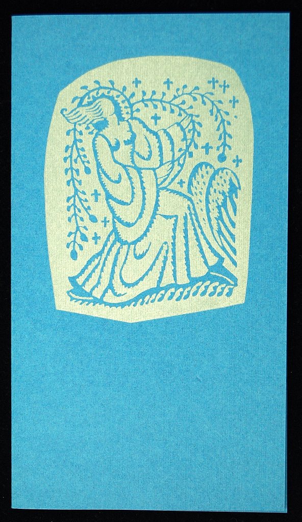
Christmas Cards 2

For the Christmas after our great friend and guru, Robin Tanner, died, I made a card by 'pasting-up' various of the delicious decorative elements he had added to an earlier Christmas letter.

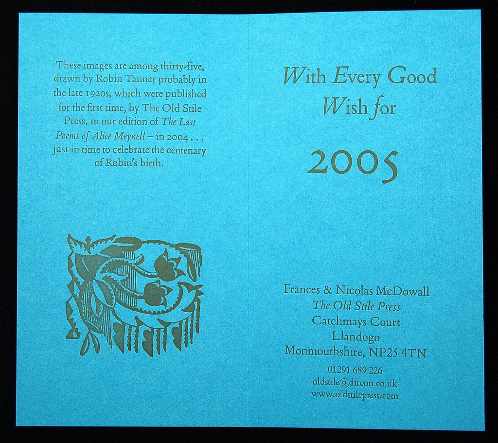
A second 'Robin Tanner' created card was made for Christmas 2004 associated with the extraordinary coincidence of our hearing about, acquiring and reprinting a book in which Robin had made many drawings in black ink within a printed copy of The Last Poems of Alice Meynell, just in time to celebrate the centenary of Robin's birth!


In quite a different mood, here is a card made from the drawings made by Gillian Martin for the two half-title pages of our edition of Edward Lear's Two Nonsense Stories . . . one starts at one end of the book and the other starts at the other - hence TWO half-titles! These stories (so much less well-known than the Poems, Alphabets &c) are entirely delightful. Looking again at the drawings in the book, it is amazing how Gillian managed to draw entirely in her own style but in a way which looks almost more Learish than Lear himself. Why has Gillian not done another book with us . . . !

04 December, 2006

Back to normal!

We are just returned from the fourth opera (in as many days) of a noble and exciting cycle of Wagner's Ring from The Mariinsky Theatre, St. Petersburg conducted by the thrilling Valery Gergiev. Oh yes . . . and we only had to get as far as the Wales Millennium Centre in Cardiff!

We are now basking in the post-catharsis phase which I reckon is one of the main reasons why people subject themselves to this particular ordeal. It is like trudging over hills and plains to Epidaurus to see crazed women do terrible things to their children and men marry their mothers. You feel cleansed for having gone through it and it is SO good when it stops . . . !

We woke (not very early it has to be said) and sun was streaming in through our window. As this photograph shows, the GOLD was safely back in the Wye (as well as the Rhine) and all looked good. Back, now, to 'real' life!

27 November, 2006

How I wish this book was one of ours! . . . 1

Anyone who has read our Bibliography, heard any talks we have given or talked with us for any time will know that the printer, Nicolas, has had no formal typographical training at all but puts whatever 'eye' and 'instinct' he may have developed in the design of books down to a lifetime of studying other people's. I love to share my favourites and, because I can post a number of photographs here which can be enjoyed at leisure, this seems a better way of doing this than putting a single photo in a book or flashing a slide on a screen.


This first book has, for years, been a complete favourite. Just to turn the pages brings tingles to my spine. Every thing about it is perfect . . . and perfectly SIMPLE.

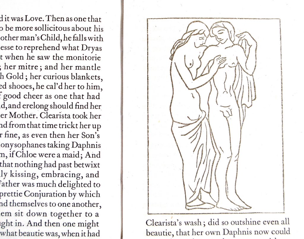
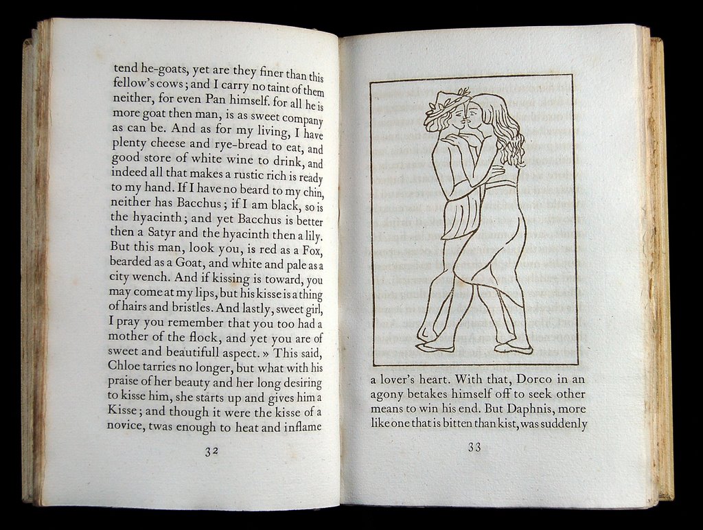
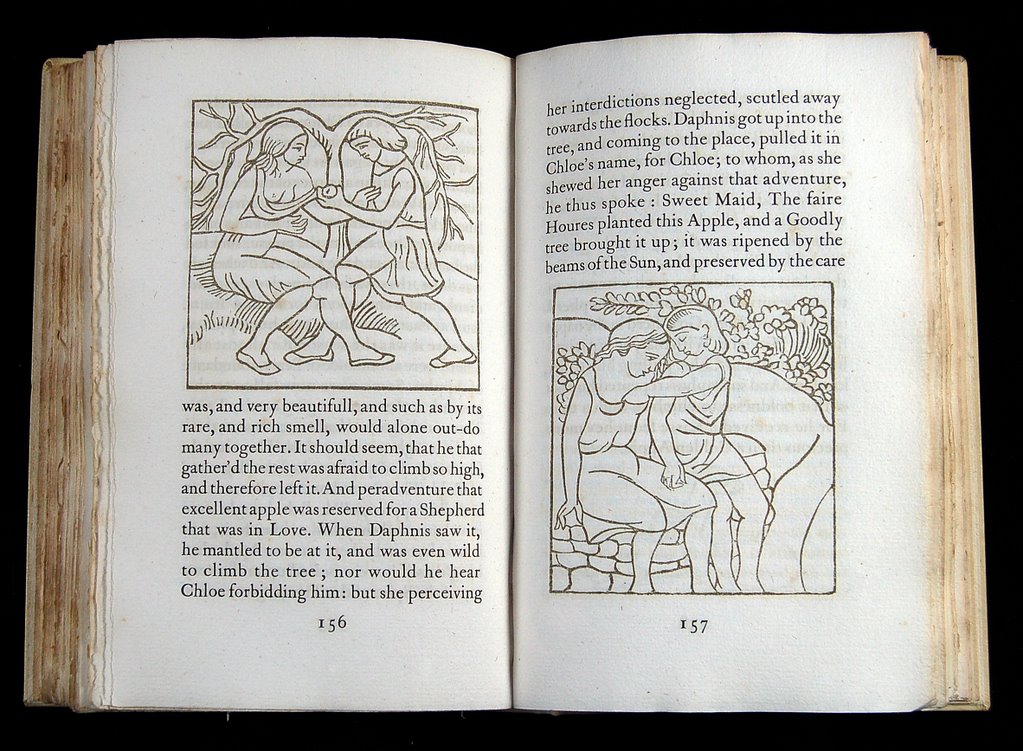
The text is Thornley's translation (1657) of Longus: Daphnis and Chloe and it was printed, on his hand-press in Paris, by Philippe Gonin in 1937 and was published by A. Zwemmer in London. The exquisite woodcuts are by the sculptor Aristide Maillol.

I hope the photographs will give something of the feel of the book but I know I am doomed to failure. [ps. Having seen these photos on the screen I feel I should modify this statement. They do in truth give a very reasonable idea of the subtleties - especially when they are clicked larger.]

The format is not large so that the book sits comfortably in the hand. The paper "hand-made paper manufactured by an old process rediscovered by Aristide Maillol" is a thickish, laid sheet of extraordinary colour and consistancy which takes the letterpress superbly, though with some see-through. The text is printed in a black ink with a greeny-brown admixture which gives the feeling that the words have emerged from the ground of the paper rather than being printed upon it. Then comes the coup de grace. The woodcuts, in which the whites of the design are as important as the lines, have been printed in a colour which is almost beyond analysis. It is lighter than the type ink, it is slightly greener and slightly more brown. It makes the images stand apart from the text totally but the difference is so slight and so subtle that both elements are melded together in perfect harmony. The binding is the simplest - vellum which seems just a variant of the text paper in colour and feel with minimal blocking and simple bands. Finally, and this is something I cannot help you with, the book has a wonderfully subtle smell!

That's all I am going to say. I will just let the photographs say what they can.