For all of the thirty-odd years we have been living at Catchmays Court - and probably about 100 years before that - a wonderfully prominent feature of the landscape has been our massive Araucaria, Chilean Pine. It was a female tree at least 30 metres high and much remarked by visitors and loved by us.
We had rather wondered what its life expectancy might be and noted its proximity to the house but it had always seemed to be very healthy - especially at the crown where yearly cones matured and cracked open on hot late summer days scattering 200 nutlike seeds each.
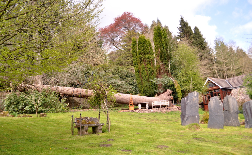
There was, however, a severe wind from an unusual direction one night a few weeks ago. We heard nothing but awoke to discover an awesome scene.

It was clear that, though everything above ground was in good shape, the roots were not . . . with a good deal of rot. We do bless the unusual direction of the wind as, had the tree been made to fall in the other direction, it would have taken a good part of the house with it.


completely blocking the drive,

apparently squashing everything it fell upon (although at the end we found that many shrubs and such had been torn and bent rather than destroyed) and

generating an enormous volume of branches, as lethal as razor wire, to be disentangled and fed into a large chipper which has produced a gigantic Mount Fuji-like mound of useful chips.
We quickly decided that we wanted to keep the trunk just where it had positioned itself - as a wonderful sculpture. I spent hours picking out the soil compacted round the roots which we had trimmed and we then set about building a stone wall to make a platform near the curve of the elephant foot base of the tree. A comfortable seat and an old marble table were retrieved from elsewhere in the garden and . . . behold!
All in all, therefore, a bit of a trauma but better down than up we now feel and that vantage point is the best of all and I can see myself sitting on it an increasing part of my old age, happily staring out over the valley and listening to the birds!