
This week, following a
Bookbinding Conference at
Warwick University, several of the participants came to visit us here, including some binders from overseas. We are always delighted to meet such people. We all spend our lives absorbed in books but we think about them in somewhat different ways! We had some lively and interesting conversations over lunch outside in glorious sunshine and they continued as the binders looked at a display of books we have printed. (For some of these, unbound copies are still available. Any bookbinders who are interested in doing their own bindings on one of our books, please ask for a list of those we still have available in unbound form.)
However, it did set us thinking about some of the books where our own bindings have been (we think!) particularly successful and involved especially interesting materials or designs evolved together with the artists working within the book.
Here, as a reminder of some of these, are photographs which concentrate on the exteriors of certain books. There are, of course, further details on our website and copies are available of each of them.
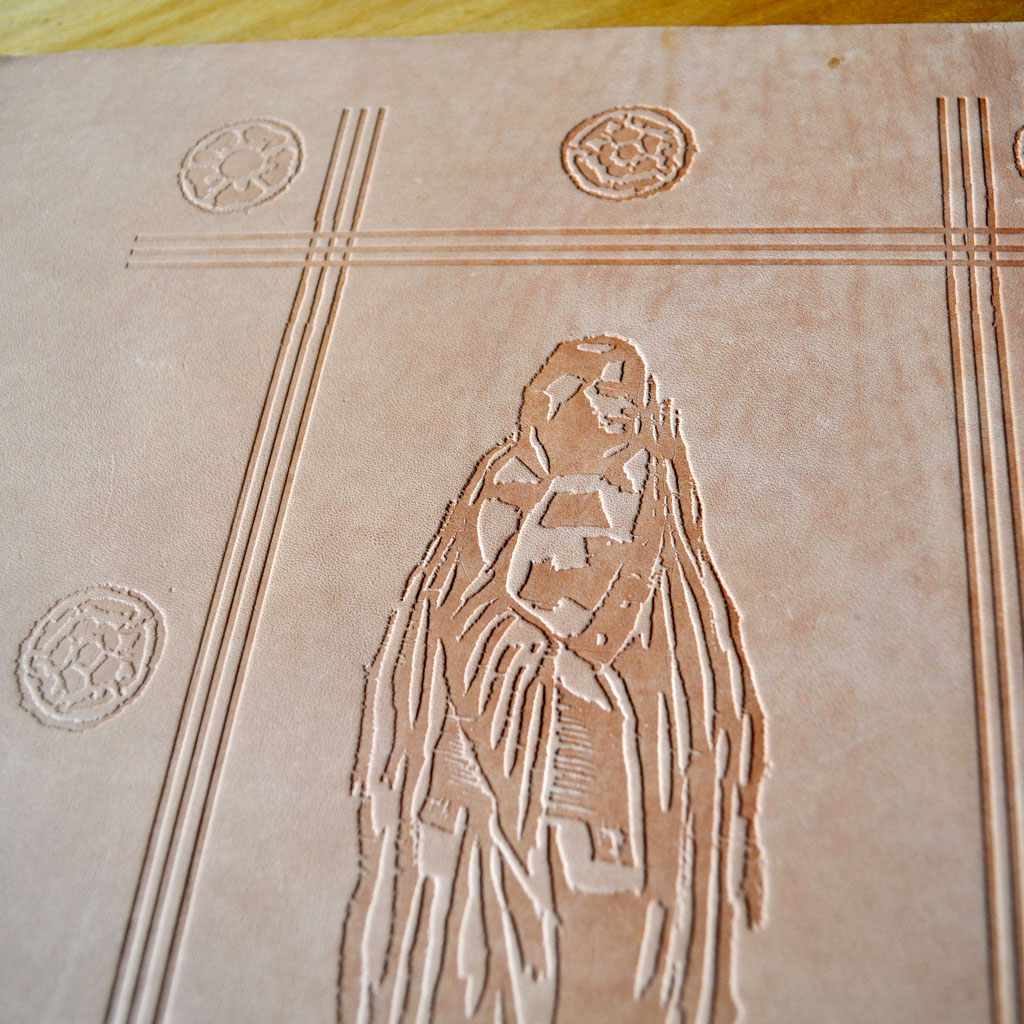
 The Dream Song of Olaf Åsteson
 was bound by Habib Dingle in wood. He had described to us how much he wished to prove that you could do an edition of a book (not just a single copy) using wood without the costs being significantly higher than a more standard binding with a slipcase. After a considerable search for suitable wood in the quantity he needed, we discovered a reclamation yard who were about to saw century-old pine beams into floorboards - we asked them to modify their measurements so that we had boards of the right thickness which Habib could then shape, sand and polish. We think he probably went through more anguish than he revealed to us but what we have is a very handsome binding totally in keeping with this very early text from a Norwegian Christian poet. Maryclare Foa has filled the interior with intense woodcut images.

Each book has a different character determined by the grain and nature of the wood used - if specially lucky the purchaser of the book may get a few nail holes which adds to the character. A groove at top and bottom has leather inserted to protect surfaces of book and shelf, and the spine is of natural leather embossed with imagery drawn by the artist.

Apart from this binding by Habib Dingle, all the other books photographed here were bound by The Fine Bindery or, as it has now become,
The Fine Bookbindery. Maurice and Kevin and their team, which has stayed together through various vicissitudes, have collaborated with us in producing designs in keeping with the artist’s intentions for each book.
 Pyramus and Thisbe
 has a strong half leather binding to remind us of the slightly clumsy workmen whom Shakespeare has caused to come together to present a play for
Midsummer and become part of the
Dream. The boards represent a stone wall with chinks through which Pyramus on the front and Thisbe on the back, peer at one another so that, right from the first, Christopher Nurse’s chiaroscuro prints set the scene for what is to come.
 Secret Commonwealth
 deals with the parallel universe of creatures which Robert Kirk describes following his research into the beliefs held by his seventeenth century contemporaries in Scotland. Second sight and faery, good and evil, fertility and the Subterraneans above and below the earth are considered. This is all suggested by the earth-coloured Harmatan leather which covers almost two thirds of the book abutting the printed images of those Subterraneans running below and among the roots of trees - all beautifully executed.
 Letters & Heads
 is a marriage of text and image though poet and artist did not know one another in spite of the fact that they were both born in Greenock, on the Clyde outside Glasgow. W.S. Graham wrote, in St Ives, Cornwall, these poems expressing the difficulty of humans really to communicate and engage with one another. Douglas Thomson paints and makes woodcut prints of heads equally disengaged and struggling to make contact with others.

We, as printer/publishers, put the two together in this book and for its slipcase Nicolas painted papers emulating the wild seas and blue skies of St Ives in a pastiche of the paintings of Peter Lanyon and others at that time.

We have created several large, almost square books with different artists who relished having a big area for their images to sweep across. One of these is Angela Lemaire’s
Pyed Pyper which uses the earliest known version in English of the tale of the Piper from Hamelin. It is not the verses of Robert Browning.

To emphasise the antiquity of this text we decided upon full bookcalf leather with rules and devices blind tooled with considerable heat so that they are almost burned into the leather. The Pyed Pyper himself is at the centre.

Not all the remarkable bindings we are highlighting here use leather - two especially involve cloth printed with designs by the artist involved. In the case of
The Revelation of St John the Divine, together with Natalie d’Arbeloff we decided upon an outside case which has a board opening in each direction. This is covered on the upper surface with a large piece of black cloth - as large as the press would take and requiring two of us to feed it into the rollers - which was printed in white to give the impression of carvings in stone. The outer boards open to reveal a face resembling that on the Turin shroud, printed in black ink on linen. The inside of the boards has paper printed with swirling wheels and deep red ‘margins’.

The book itself is a concertina fold so that the deeply impressed imagery is only printed on one side of the Arches paper. The pages are joined with linen strips on the outer edges. This book was exhibited together with the earliest known copy of
Revelation and numerous others printed over the ages which now reside in the Chester Beatty Library in Dublin - some company to keep!


The second binding involving cloth printed on our press, with a design by the artist who created the book’s images, is Martin Pitts’
The Waternymph and the Boy. The cloth is a soft blue linen printed with watery swirls and poolside plants in honey coloured ink on a cover that is flexible and tied with gold grosgrain ribbons. The poem within is a Victorian version by Roden Noel of Ovid’s
Salmacis and Hermaphroditus.


