27 November, 2006

How I wish this book was one of ours! . . . 1

Anyone who has read our Bibliography, heard any talks we have given or talked with us for any time will know that the printer, Nicolas, has had no formal typographical training at all but puts whatever 'eye' and 'instinct' he may have developed in the design of books down to a lifetime of studying other people's. I love to share my favourites and, because I can post a number of photographs here which can be enjoyed at leisure, this seems a better way of doing this than putting a single photo in a book or flashing a slide on a screen.


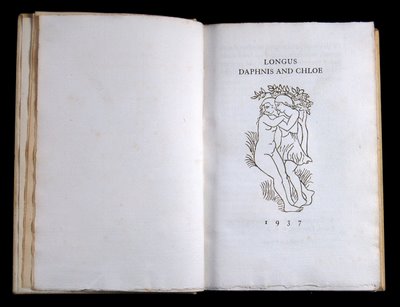
This first book has, for years, been a complete favourite. Just to turn the pages brings tingles to my spine. Every thing about it is perfect . . . and perfectly SIMPLE.

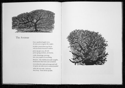
The text is Thornley's translation (1657) of Longus: Daphnis and Chloe and it was printed, on his hand-press in Paris, by Philippe Gonin in 1937 and was published by A. Zwemmer in London. The exquisite woodcuts are by the sculptor Aristide Maillol.

I hope the photographs will give something of the feel of the book but I know I am doomed to failure. [ps. Having seen these photos on the screen I feel I should modify this statement. They do in truth give a very reasonable idea of the subtleties - especially when they are clicked larger.]

The format is not large so that the book sits comfortably in the hand. The paper "hand-made paper manufactured by an old process rediscovered by Aristide Maillol" is a thickish, laid sheet of extraordinary colour and consistancy which takes the letterpress superbly, though with some see-through. The text is printed in a black ink with a greeny-brown admixture which gives the feeling that the words have emerged from the ground of the paper rather than being printed upon it. Then comes the coup de grace. The woodcuts, in which the whites of the design are as important as the lines, have been printed in a colour which is almost beyond analysis. It is lighter than the type ink, it is slightly greener and slightly more brown. It makes the images stand apart from the text totally but the difference is so slight and so subtle that both elements are melded together in perfect harmony. The binding is the simplest - vellum which seems just a variant of the text paper in colour and feel with minimal blocking and simple bands. Finally, and this is something I cannot help you with, the book has a wonderfully subtle smell!

That's all I am going to say. I will just let the photographs say what they can.


25 November, 2006

Christmas Cards

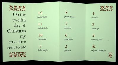
In the printing office, I am working on this year's Greetings Card - rather later than usual. I will keep you posted! Meanwhile I thought it might possibly be interesting to look at some of the Cards from previous years. This was a very early (still in Blackheath) one and was one of the very few that was not tied to 'work in progress'. It was designed to be found amusing by fellow printing addicts and, for such folk again, I will write out the words which are too small to read.
12 founts of Caslon, 11 moulds & deckles, 10 treadle platens, 9 bleeding margins, 8 printers' flowers, 7 cancel titles, 6 frisket fingers, 5 swell rules, 4 tins of ink, 3 swash caps, 2 composing sticks & a Clymer Columbian!


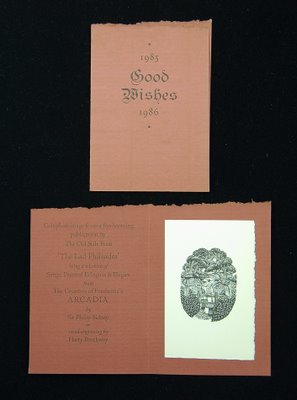
Below is another very early one made while I was about to start work on The Lad Philisides (now sadly almost sold out) which has always been one of our favourite books. Harry Brockway had begun to produce the most delectable wood engravings but had started with this one - to be used on the colophon page, which is why it involved a 'stile'.

I was to gain 'practice' in the printing of the blocks by printing it for this card. I thought the result was rather good but Harry gently took me aside and expounded his views on imparting a 'silvery' quality to the printing of his blocks. It was a lesson well learned and I look now at the engravings in the book and cannot quite believe that I printed them.

The card was printed on a pile of offcuts of the delicious Fabriano Roma bought for £1 during a group visit to Christopher Skelton's printing works at Wellingborough.


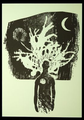
This card is quite a recent one. The image is the one made by Sara Philpott for the frontispiece of Poems of Light, the first book by the Romanian poet Lucian Blaga, wonderfully translated by our friends Oltea Simescu and Eric Williams.

I might just return to this theme later and drag out a few more cards from the bottom drawer!

18 November, 2006

Robert Macdonald's prints in Brecon

We have been to the Private View, at the Mount Street Gallery in Brecon, of an exhibition of the prints of Robert Macdonald, for many years an important figure in the artistic life in this part of the world . . . although he was originally from New Zealand. He came to Britain in 1958 and enrolled at the London Central School of Art where his tutors included such mouthwatering names as Keith Vaughan, Mervyn Peake and Cecil Collins! He has had considerable success with his printmaking but also with writing and with painting. He is currently writing a book on Wales to be illustrated with his own drawings and prints.

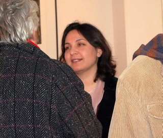
The Exhibition was 'opened' by Sameera Khan, the egregious and much lauded Studio Manager of the Swansea Print Workshop. Many artists known to us have been full of praise for her enthusiasm, knowledge and, above all perhaps, her willingness to tackle an artist's problem by leaping in so that it can be solved together.


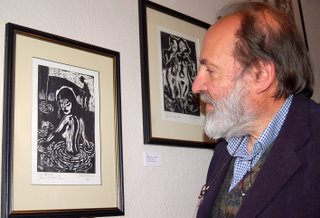
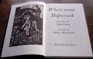
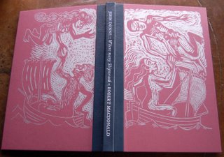
Here Robert stands beside a framed proof of one of the wood engravings he made for The Old Stile Press edition of the early poems of John Donne entitled Where Many Shipwrack. The book was published in 2004 but the numerous wood blocks were about four years a-cutting!

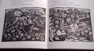
This intense and earthy love poetry seems to have found a perfect accompaniment in Robert's strong, immediate and passionate woodcuts.

The exhibition runs until 24th December, 2006 and full details of Where Many Shipwrack (including the Special Edition, of 26 copies, each of which includes a number of signed and numbered proof prints and an original watercolour painting) can be found by returning to our website.

14 November, 2006

Construction work!!


Unfortunately, just at the time when it is first possible to flit between this Journal and the OSP website (Oh Joy! Oh Rapture!, I hear you cry . . . !) and at a time when we have just send out two leaflets for our new books, the site happens to be in the process of being updated and is somewhat incomplete at present - to the extent of there being nothing on the site about our four latest books.

Nobody is really responsible for this large 'hole in the road' and we are just very sorry that it happened at this precise moment. Works will be completed asap and announced here. Do please contact us if we can be of any help.

13 November, 2006

Lo, the LINK has been created!

Today we are happily able to celebrate the fact that the Wizard of our Website has redesigned the 'front door' of the site to enable visitors to visit here as well as decide to wander round the more permanent bibliographical vastnesses of the site. You could have a look here. Or WELCOME, if you have just arrived!


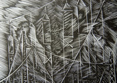
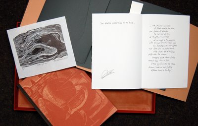
It seemed appropriate to dig, once again, into the treasures of The Abstract Garden. With no permission, I here take a detail from Peter Reddick's engraving to Philip Gross's The Listening Station which is a very beautiful poem by any standards but which gives, for me, a wonderful image of the internet - a manifestation which I cannot begin to understand but which fills me with wonder. An extract, therefore . . .

. . . or it's scaffolding
for a vast construction

made of shades of light and language,
girder-work so fine

and taut and twangling you could fold
it all into a suitcase,

early morning, with a sound a bit like rain.

11 November, 2006

More about "The Abstract Garden"

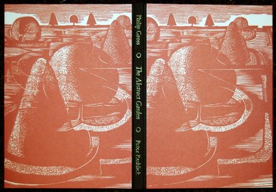
A little bit more about this lovely book, from the point of view of the participants. We have just sent out our prospectus so the book’s success (or viability!) is now in the hands of our loyal friends. An exciting moment but also one tinged with ‘last night blues’. Such is the pattern of our operation that Frances and I are usually working with a very much alive artist but with a dead or at least absent author. On this occasion, however, both roles were taken by artists very much with us . . . and what fun it was.


Summer lunches outside at Catchmays Court, I remember, as the plans began to form and emails from one to another and copied to the third. Always close the loop. When shall we three meet again? . . . Then the jokes, me as ‘the spaceman’ for my role as magician of the underlying grid which ordained where things should ‘go’ and which made it so that a title, let’s say, seemingly stuck in the middle of an open space, would nevertheless look just right.

On the Severn Bridge, which has (expensively) to be crossed by all seeking to go from Bristol to Monmouthshire, there are different ways to pay. You can pay an attendent, you can fling the correct money into a bin or you can prebuy some sort of season ticket. There are notices indicating where this last can happen - TAG. This, however, was the shorthand term for our book. I, for one, thought it a supremely romantic notion that there were signs on the Severn Bridge to The Abstract Garden!


Another memorable moment in the process was when we had finally to put into order the poem/engraving units. Some spreads had to be confined to the centre of sections as engravings had been allowed to go over the gutter and I thought it best if we were to lay out all my paste-ups on the floor. They started in one room, went across a hallway and into another room. All concerned then paced up and down, poring over this river of paper, putting the case for this to come before that or after the other. All accomplished with the greatest good nature and ultimately successfully, we felt.

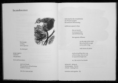
Such was my respect for Peter and his status as elder statesman of the wood engraving world that I was in terrible fear of falling too far below his standards when it came to printing. Each of the wood blocks was a dream to print. Some of the surfaces that had to be used because of the size of the subject in the context of the page were not so sweet, however, either for Peter to engrave or for me to print. In the end, though, I am quite happy and rather proud of how it all came out. The binding works very well, too, we all think. Ten copies with proofs of some images and autograph poems signed appropriately (below) will be prized possessions for a lucky few, although almost all have already been spoken for.


Great fun. Happy memories! . . . and now on to the next exciting venture!

10 November, 2006

John Hudson in The Western Daily Press, September 25th 2006


Wood brings pages to life
Books become a work of art at Old Stile Press, where wood engravings,
woodcuts, linocuts and other relief blocks are expertly handled by
Nicolas McDowall. John Hudson finds out more.

SOME of Britain's most beautiful books are being produced from a rambling old house beside the River Wye just down- stream from the village of Llandogo.

Nicolas and Frances McDowall have been running the Old Stile Press there for 20 years, and while feeling they're "the luckiest people in the world" in doing so, they are also playing a major role in promoting and encouraging many of the country's most talented artist-printmakers.

An Old Stile book is a bringing together of words by writers living or dead with illustrations created through wood engravings, woodcuts, linocuts and other relief blocks, with Nicolas McDowall's skills in page design the third vital ingredient. Nicolas, now 69, can look back on a lifelong love of fine books and years in mainstream publishing as part of his long "apprenticeship" while Frances looks after all the sides of the business that do not involve page-preparation and printing.

An early inspiration was John and Rose Randle's Whittington Press, then in the Cotswolds near Cheltenham and now based in Herefordshire. The McDowalls started Old Stile from their London home in Blackheath, but it has been since they moved West that it has grown in stature to where it is today, with a list of some 50 volumes and a customer list that has taken in the British Library, Cambridge University, the Museum of the Book in Amsterdam and a score of United States collections that take in the university libraries at Yale, Harvard, Johns Hopkins and UCLA.

Books tend to be in limited editions of 150 to 350, and they can cost hundreds of pounds. Raw materials are of the best, with price tags to match, and the binding, which is done elsewhere, is always superb. Stemming from a visit to the paper-makers of Wookey Hole, Frances has experimented imaginatively and exuberantly with papers of her own, some of which have been used in occasional books. Her onion paper has been described as "almost edible". Nicolas is not precious about the use of mechanical aids. For years, most of the typesetting was done by the late Bill Hughes, of Upton-upon-Severn, on a Monotype machine, and now he does it himself on computer, using grand old typefaces such as Bembo, Bulmer, Blado and Baskerville. The settings are printed down to polymer plates and hardened by ultraviolet light to produce line blocks, after which printing is done on a proofer which, while automated, still calls for personal attention to every sheet. Like most enthusiasts, the McDowalls have a range of weird and wonderful printing presses in their collection, including the most glorious of them all, a mid-19th-century Columbian, complete with golden American eagle, but it's much more run-on-the-mill equipment that does the lion's share of the work.


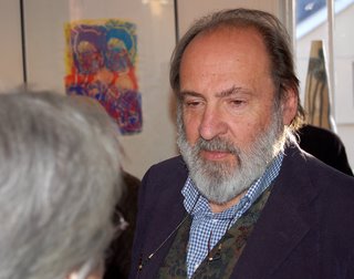
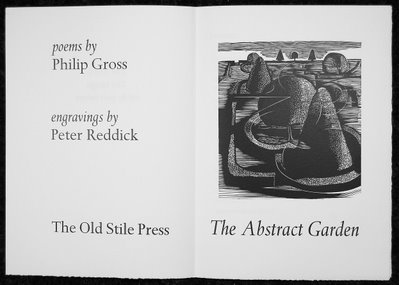
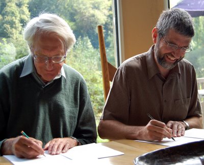
Just out from Old Stile is The Abstract Garden, a joint project between two of Bristol's most distinguished artists, the poet and novelist Philip Gross (right) and the veteran wood-engraver Peter Reddick (left).

Philip says: "I've known Peter for quite a few years. We're both members of
the same Quaker meeting at Redland, and we've always liked and admired one another's work and talked about working together.

"It never quite happened, but when the Old Stile Press asked him if he could think of a poet's work he would like to produce a book of illustrations around, he came back with me.

"We told them we wanted do new work on both sides, responding to one another. We couldn't know at the start what it would grow into in the end, but we both had this garden concept we wanted to explore. An active ingredient in the book's creation

"The creative process worked both ways. He has done images starting from early drafts of poems of mine, and I've written on what I've seen, or best of all, I've looked around in his sketchbook and written about a sketch which has then influenced his eventual piece of work.

"It's taken a couple of years. Nicolas McDowall is an artist in his own
right, an active ingredient in the creation of the book. There's a poem in it which uses the phrase 'the word, the image and the space between'. The end result is an object of art in its own right, one that will last for hundreds of years."

Peter Reddick is best known to many people for his illustrations to the entire Folio Society series of Thomas Hardy's novels, and he was also commissioned to design covers for a number of Penguin editions of the novels of Daphne du Maurier.

Born in 1924, he was senior lecturer at Bristol Polytechnic between 1967 and 1989, was a founder member of Bristol Artspace and is chairman of the Spike Island printmakers' workshop on the Bristol dockside. Long admired as an artist by Nicolas McDowall, who also shares his Quaker philosophy, Peter Reddick joins a long line of brilliant contemporary artists to be showcased by the Old Stile Press. Few are household names, though many readers will remember the work of Robin Tanner, the Wiltshire engraver who played a significant part in the early days of the press.

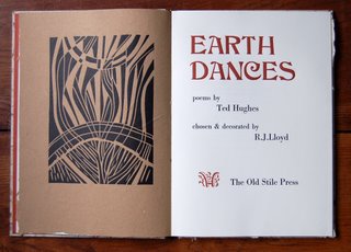
As for Philip Gross, he joins a list of writers for Old Stile that ranges from St John to Ted Hughes, Shakespeare to Edward Lear, Oscar Wilde to the Brothers Grimm, all presented in a way never encountered before. Nicolas McDowall has particularly fond memories of the Ted Hughes project, a collection of his nature poems illustrated by Reg Lloyd. Hughes, then poet laureate, wrote an extra poem expecially for the book, and Nicolas still remembers the thrill of typesetting it for the first time, the first time anyone other than the poet and the artist had seen it. It's one of a thousand memories he and Frances share - and they plan to keep on adding to them for many years to come.

Leading the Cranes Home


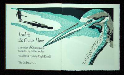
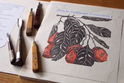
One of the star attractions on our stand at the LAB Fair, as we had fully expected, was Leading the Cranes Home, the collection of ancient Chinese poems (in timeless translations by Arthur Waley) with colour woodcut prints in the Japanese style by Ralph Kiggell . . . whose wood cutting tools are shown here when the book was at an early 'paste-up' stage.
Our meeting with the artist was a good example of the creative chance taking that has played such a powerful role in our history. A number of years ago, we were offered the lower exhibition space in the Fine Art Society's gallery in London's New Bond Street for a week. During that time we met a fascinating number of folk, some of whom had come along to see us specifically but many were just visiting the FAS. Among these was Ralph who had come to London to visit the Print Fair at the Royal Academy and just happened upon our books.
He was interested in what he saw and we ended up talking for most of the afternoon!

09 November, 2006

This conversation sowed the seeds of this collaboration which has, otherwise, largely been conducted by email - between Wales and Bangkok where Ralph lives and works. Normally the artist prints his own work on Japanese paper, with water-based inks and prints by hand with the help of a baren. While I was of course to use the same wood blocks, my paper was to be heavy yet soft printmaking paper from the UK, oil-based inks and my printing press. I was very well aware of the many challenges but the results were very satisfying to both sides and people who have the opportunity of turning over the pages for themselves say that it is a full and beautiful experience.

08 November, 2006

One of the elements that made for the success of the project was the sensitive help given to us by our friendly inkmaker (just round the corner as it happens but probably the best in the business) Cranfield Colours Ltd in Cwmbran. We gave them small swatches of Ralph's Japanese paper proofs in the appropriate colours and asked for the inks to be as translucent as possible. They joked that all I had ended up with was a tin full of 'extender' with only a tiny amount of colour added but that is just what was needed so that, when another colour (even black) was printed on top of one already printed it did not obliterate it but formed another colour. There are many lovely examples in this book of this technique,

07 November, 2006

At the start of my part of the job I did, rashly, work out the total number of printings that I had to do in order to complete the 150 copies in this edition. It was such a daunting number that I tried to chase it from my mind! The book was, however, tremendously satisfying to work on . . . largely because of the consummate craftsmanship on the part of Ralph that shone out more and more as I got closer and closer to the blocks themselves.

06 November, 2006

The London Artists Book Fair


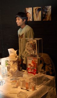
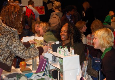
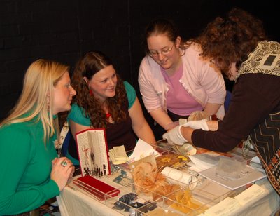
We have just returned from a weekend in London, where we lived so happily for many decades but which now seems such a distant place and which needs such a real struggle to leave our safe and fulfilling valley in Wales. This Fair has been going for thirteen years, in a variety of venues, and is simply tremendous fun. In the context of a number of 'Fine Press' fairs, us Old Stilers are regarded by many as being dangerous radicals not afraid to perpetrate printing methods and solutions which Caxton (or William Morris) might not have approved of but here we are regarded, but fondly, as representing the old guard. Much of what I saw exhibited I found hard to appreciate but much again excited me and made me think. Above all I was thrilled by the excitement on the faces of so many of the people who had brought along the book objects which they had made . . . and on the faces of those who thronged round to examine them.


The variety of stuff on show was immense, items being priced from £1 or less up to a set of half a dozen prints for £4000 and more. We cannot really decide whether such extreme variety makes good commercial sense either for the contributors or their would-be punters but at least there must be 'something for everybody' there and everyone seemed happy. It is hard to judge how people 'did', I would think that fortunes were mixed. We certainly met many new folk who seemed to like what we do and, hearing them say so, recharges our batteries really well to face a winter in the country and the possibility that this block will not print or the press will go on strike against the cold (or the printer will!).


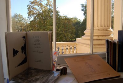
The River Wye comes to The Mall! The Fair was held in the Institute of Contemporary Art's magnificent Nash Terrace home at the other end of The Mall from Buckingham Palace. It was stunningly lovely weather for November and our stand was fortunate enough to have this glorious window on to the Park. Although we had mostly brought only our most recent offerings (as we had travelled up to London by National Express coach rather than by car) the Wordsworth poem on Frances' handmade paper had crept in and looked good.


Visitors to the Fair came in a variety of shapes and sizes and their approach to enjoying and evaluating the bookworks on offer varied accordingly. For comfort and an original solution to the problem of acute short-sightedness, this, I thought, took a lot of beating.

01 November, 2006

This is us . . .


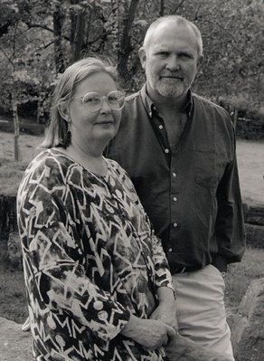
Behold the principals and total workforce of The Old Stile Press!
Photograph by Bernard Mitchell.

As we have just learned how to do it, this is a good point to give
a link to our website.

Work is going on at this very moment to bring it up to date but our
earlier books are fully listed, together with other things.

New Month: New Journal


It has taken me hours (if not days!) to find my way around this site so as to fill in all the boxes with information and learn how to play with text and photographs. At last, though, I think I am sufficiently up to speed to start off . . . on the first day of a brand new month.
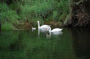
As befits our views on the relative importance of things, we felt that this scene of life on the river Wye that passes along the edge of our domain would get us off to an appropriate start. Actually it was taken earlier in the year but I can say that, in recent days, the parent swans and two of their cygnets (now in late adolescence, though less than a year old!) have been gliding happily around the same part of of our river.
Incidentally, the photograph was taken from our side of the river, which is in Wales. The bank shown behind the swans is, however, England.

Now we will get on with talking about books . . .